Performance Summary
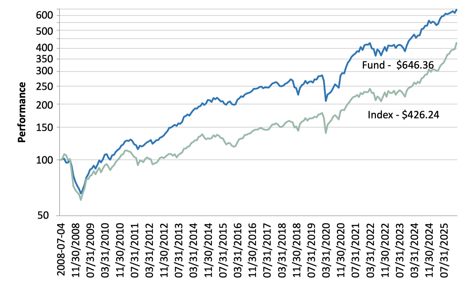
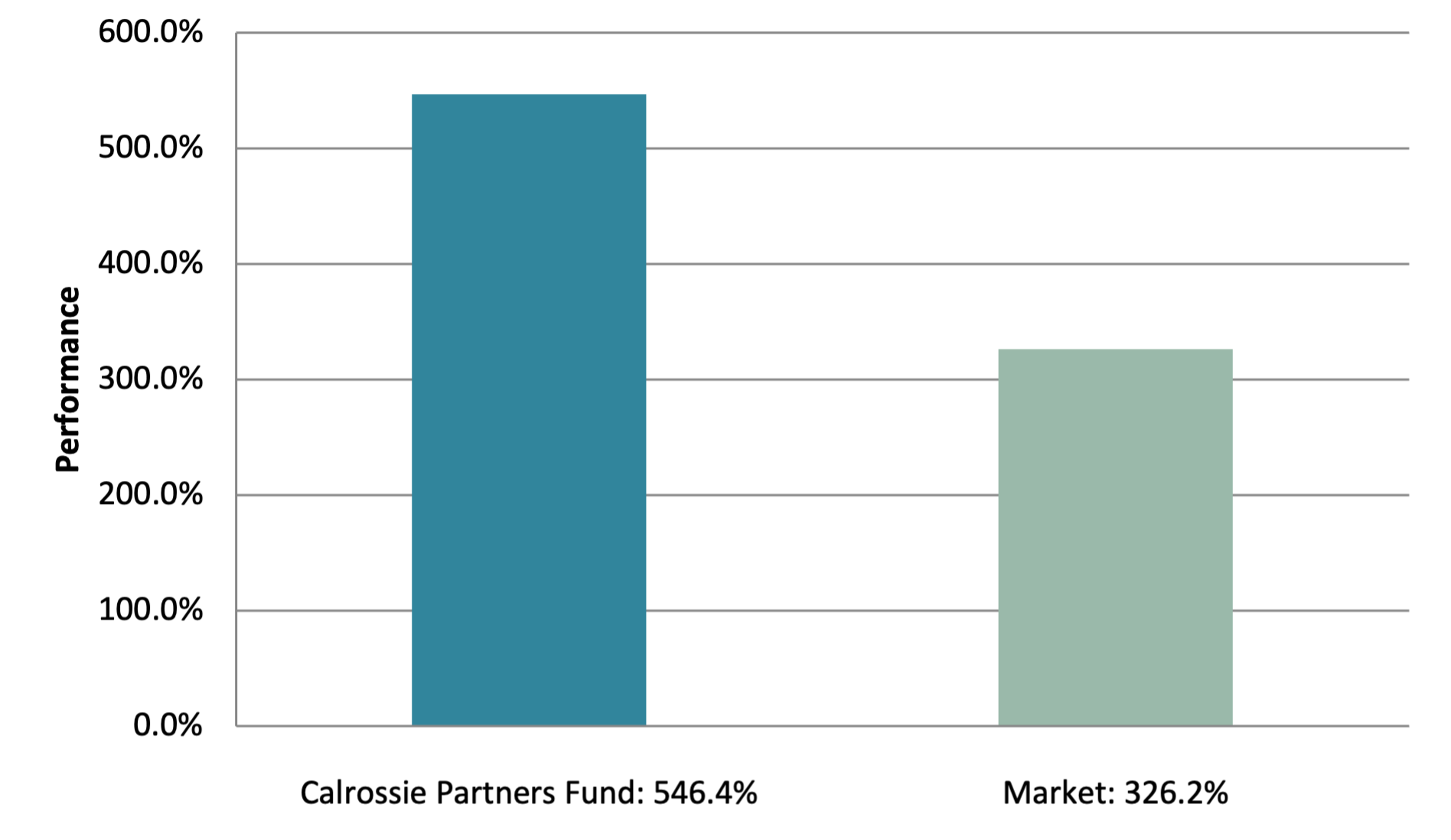
The Calrossie Partners Fund has substantially outperformed the market since inception in 2008. The two graphs below highlight this performance by showing:
The monthly performance of the Fund compared with the market (S&P/TSX Total Return Index), on the assumption that $100 was invested in each on April 7, 2008, the commencement date of the fund.
The total cumulative return of the Fund versus the market, since Fund inception.
Fund returns are after all fees and expenses
Calrossie Partners Fund vs. S&P/TSX Total Return Index
April 7/08 to February 28/26
Total Return Since Inception
April 7/08 to February 28/26
The Fund net asset value figure shown in the graph includes reinvestment of the annual unitholder distribution, which is why it is higher than the reported monthly figure. Note also that the top graph uses a logarithmic scale in order that equal percentage gains will appear the same size at any point on the graph. Using this scale makes the graph a truer visual representation of performance. While the Fund does not have a closely comparable index, the S&P/TSX Composite Total Return Index referred to above has some broad similarities to the Fund and so is a useful benchmark, in our opinion. The Composite Index is a useful comparison in that it focuses on the broad Canadian stock market. However, it differs from the Fund in that: (1) It does not use the financial leverage referred to above; and (2) It is not focused on dividend paying stocks. Investors should also note that the Composite Index overstates actual obtainable returns in that it does not reflect management fees or trading costs, whereas the returns shown for the Calrossie Partners Fund are net of all expenses.

